
overview
Rideaway is a ride-share service focusing on seniors that want to feel a sense of independence, accommodating for specific health requests and opportunities for third-party assistance.
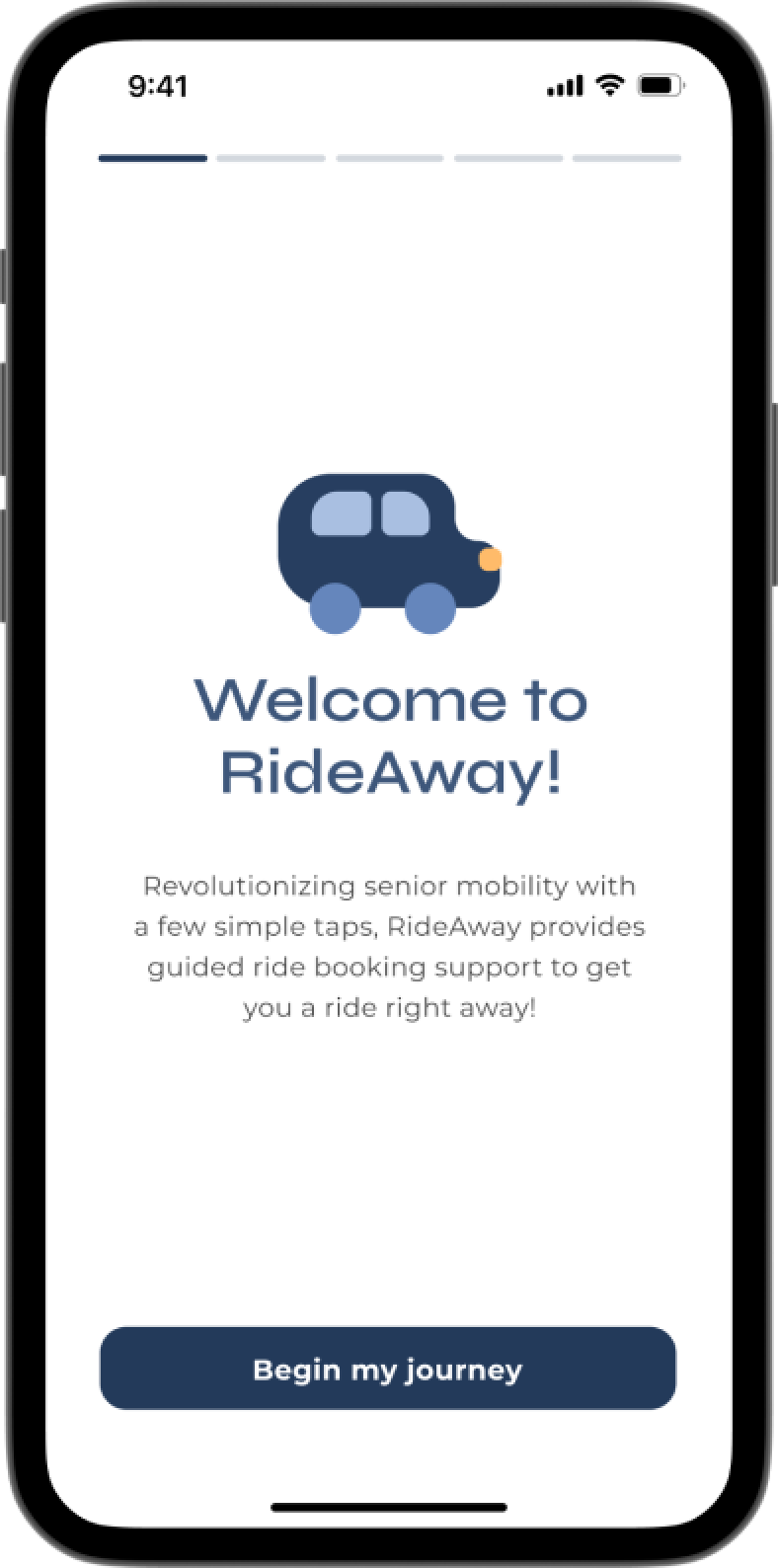
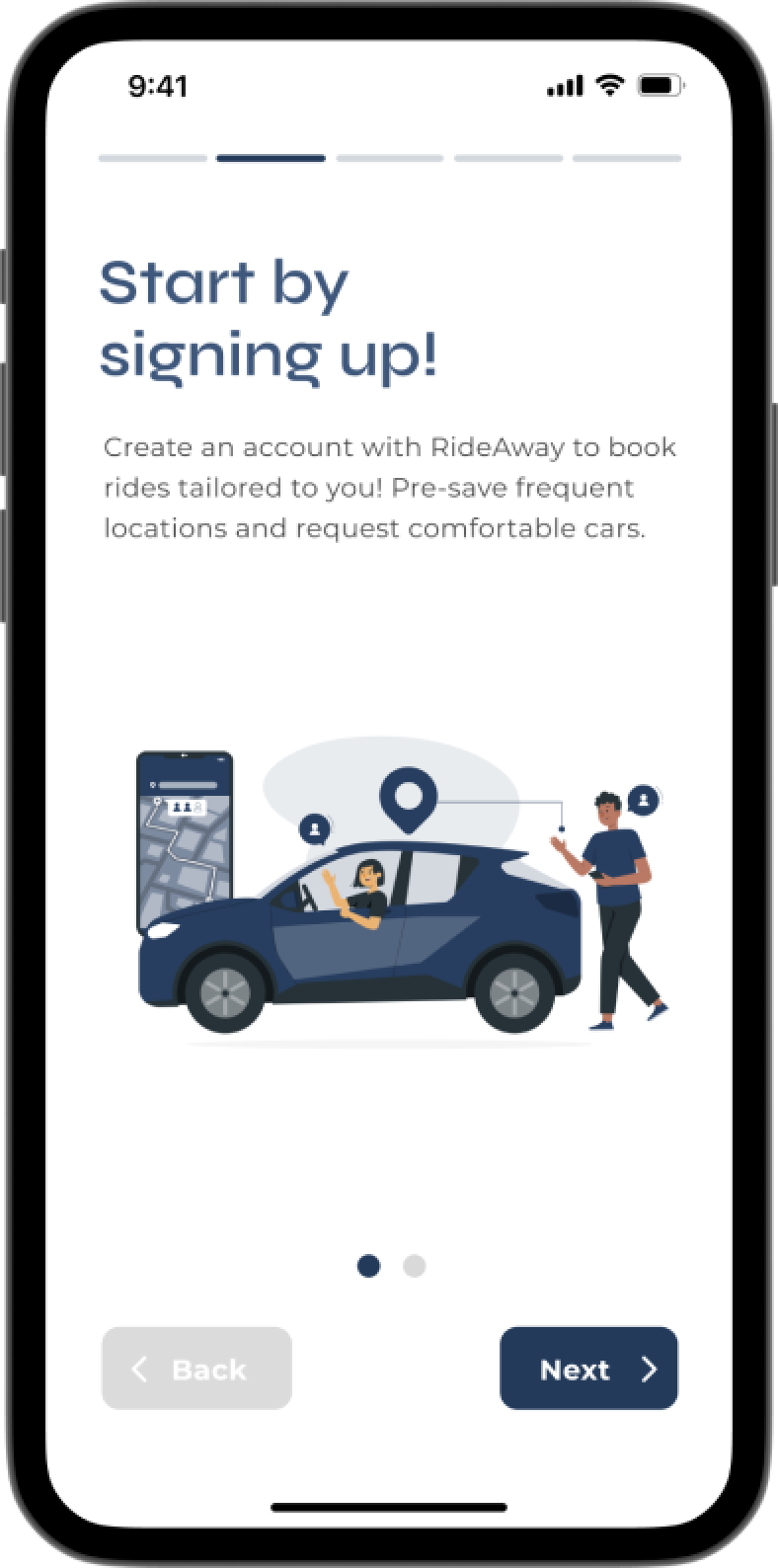
This was an academic project for an interaction design course, creating an app prototype for seniors aged 75+. The prototype encompasses 3 key interactions: user onboarding with guided assistance for health requests, booking through pre-saved destinations, and lastly third-party support.
Before diving into our primary interactions, we first had to select a target audience. After continuous brainstorming and exploration of the current app market, we found several concerns with current ride-share services.
These issues included: potential for age discrimination, increased likelihood of ride cancellation if requests are too specific, and rushed time limits which may stress users out.
target audience
those who feel frustrated by current rideshare interfaces (e.g. Uber, Lyft)
limited experience with mobile apps
rely on external assistance with technology
likely have physical health conditions (poor joints, eyesight, hearing)
interactions
1). user onboarding screens with guided assistance and personalization for health requests
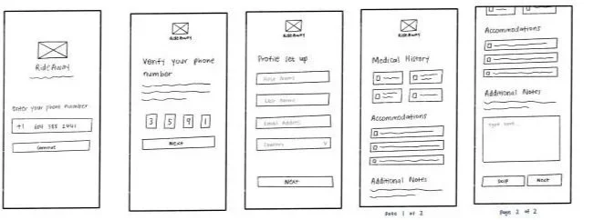
wireframes of onboarding screens
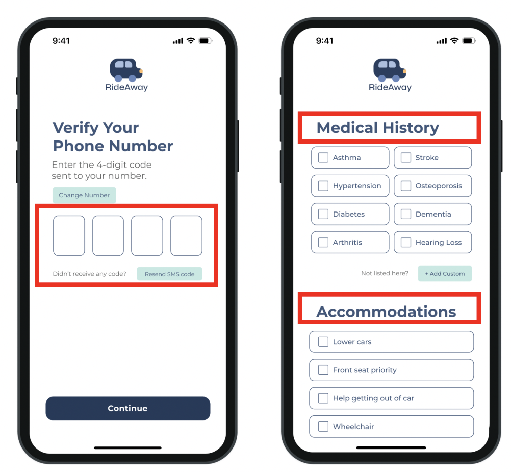
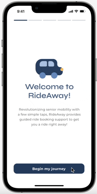
Upon opening the app at first, I created brief tutorial screen mockups to greet the user and guide them through the set-up process. Through toggleable suggestions, typed responses, and drop down menus, users are able to fill in what they need with ease.
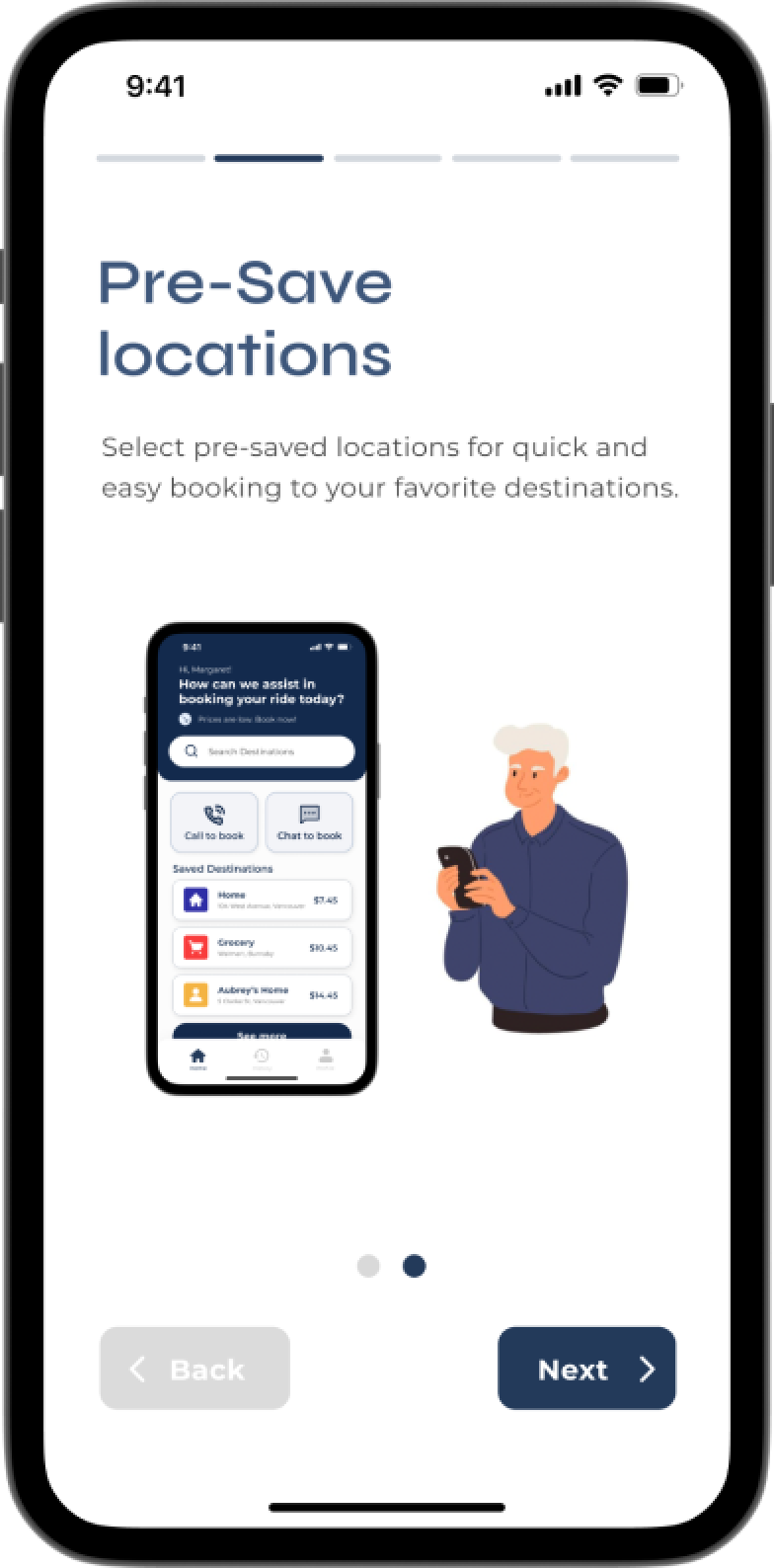
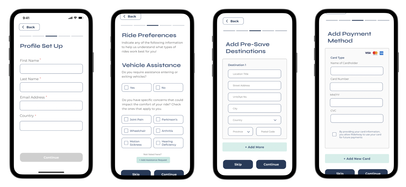
users can set up any accommodations that apply, optionally set up pre-save destinations, and also optionally, their payment method ahead of time
I chose to sandwich the user onboarding process between the tutorial screens to ensure that users will be less likely to forget what to do next compared to it happening at the very end. These screens were designed with Figma and then prototyped in ProtoPie.
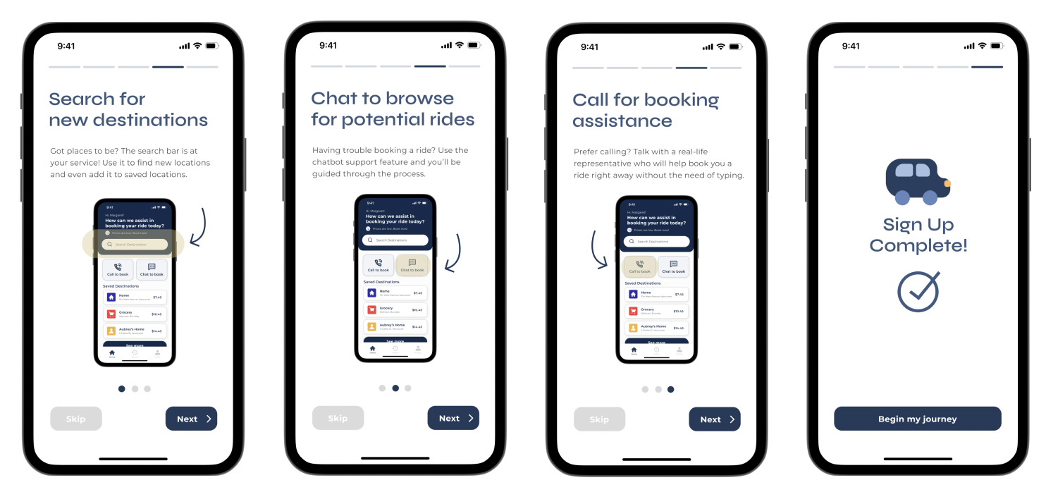
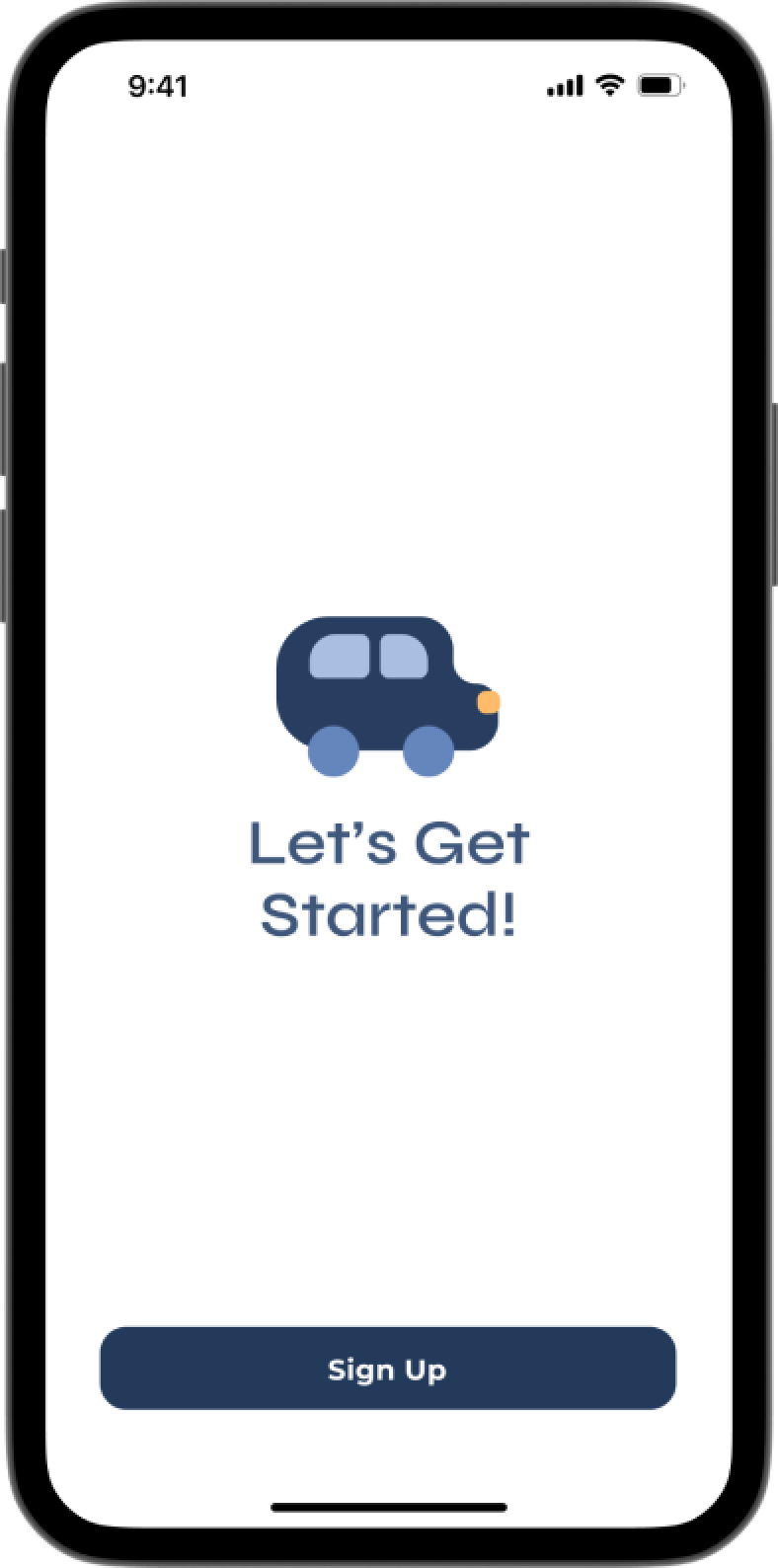
after the sign-up process, I created a set of secondary tutorial screen mockups to remind the user of the general accessibility and how to use the app
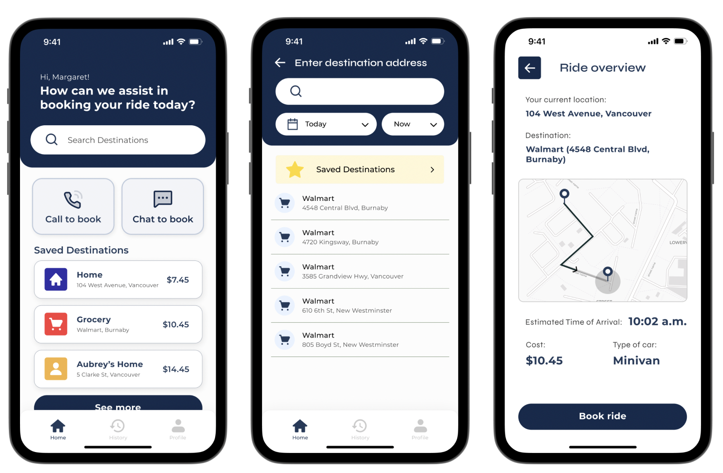
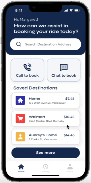
2). booking through independent searching/pre-saved destinations
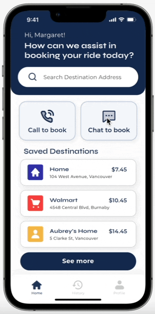
This feature allows for user flexibility to independently search and book through a list of pre-saved destinations. The main booking feature would be through independently searching.
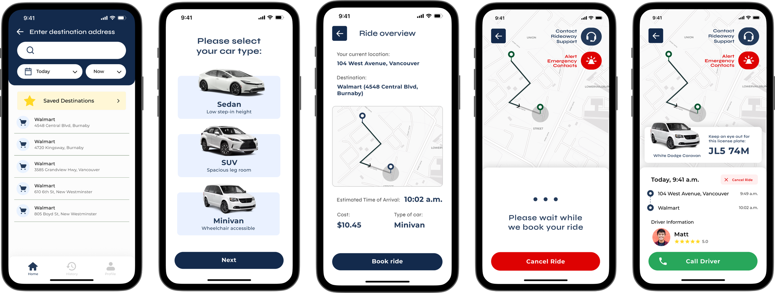
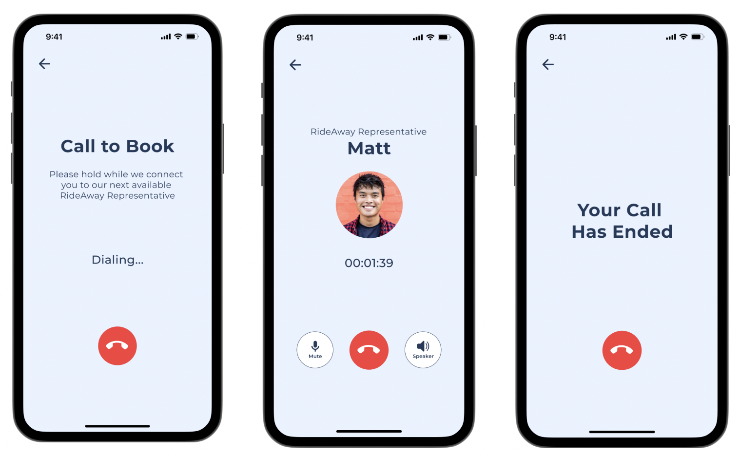
user flow of booking through independent search. The details of the ride, including the license plate, driver information, and support are presented on the screen. Users are given the opportunity to call the driver if necessary
chatbot support
call a live representative
When users book using the pre-save destinations feature, they can pick from the list of destinations that they’ve added on the home page and also go through a similar booking process as independent searching.
this feature eases the user’s cognitive load and minimizes the need for interface interaction, which may otherwise stress out the user
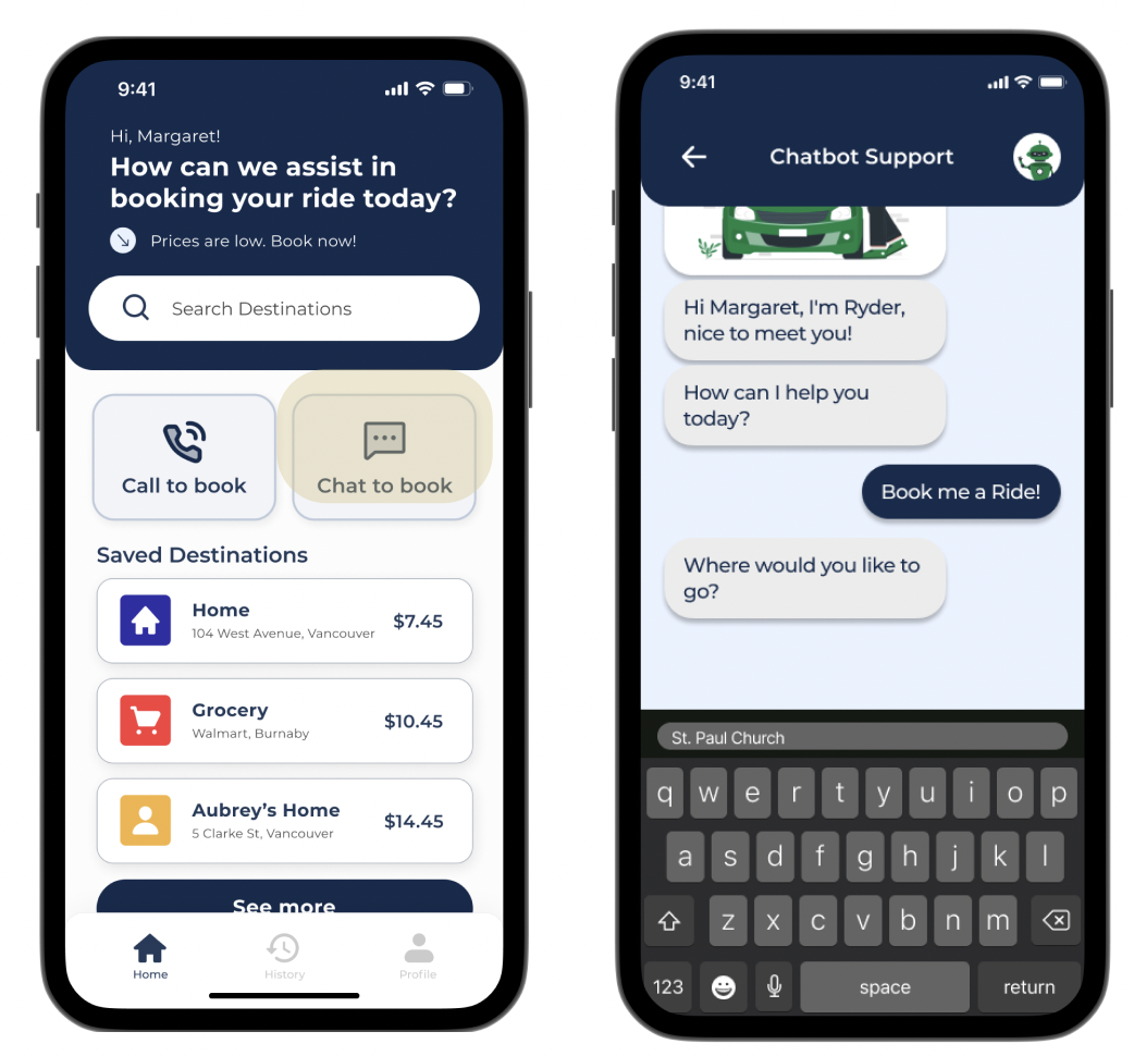
3). booking through third-party assistance
The last key interaction is a simulated third-party support feature, providing guidance to users in a more empathetic way and allowing them to easily modify and confirm ride preferences. This interaction is available in two different options.
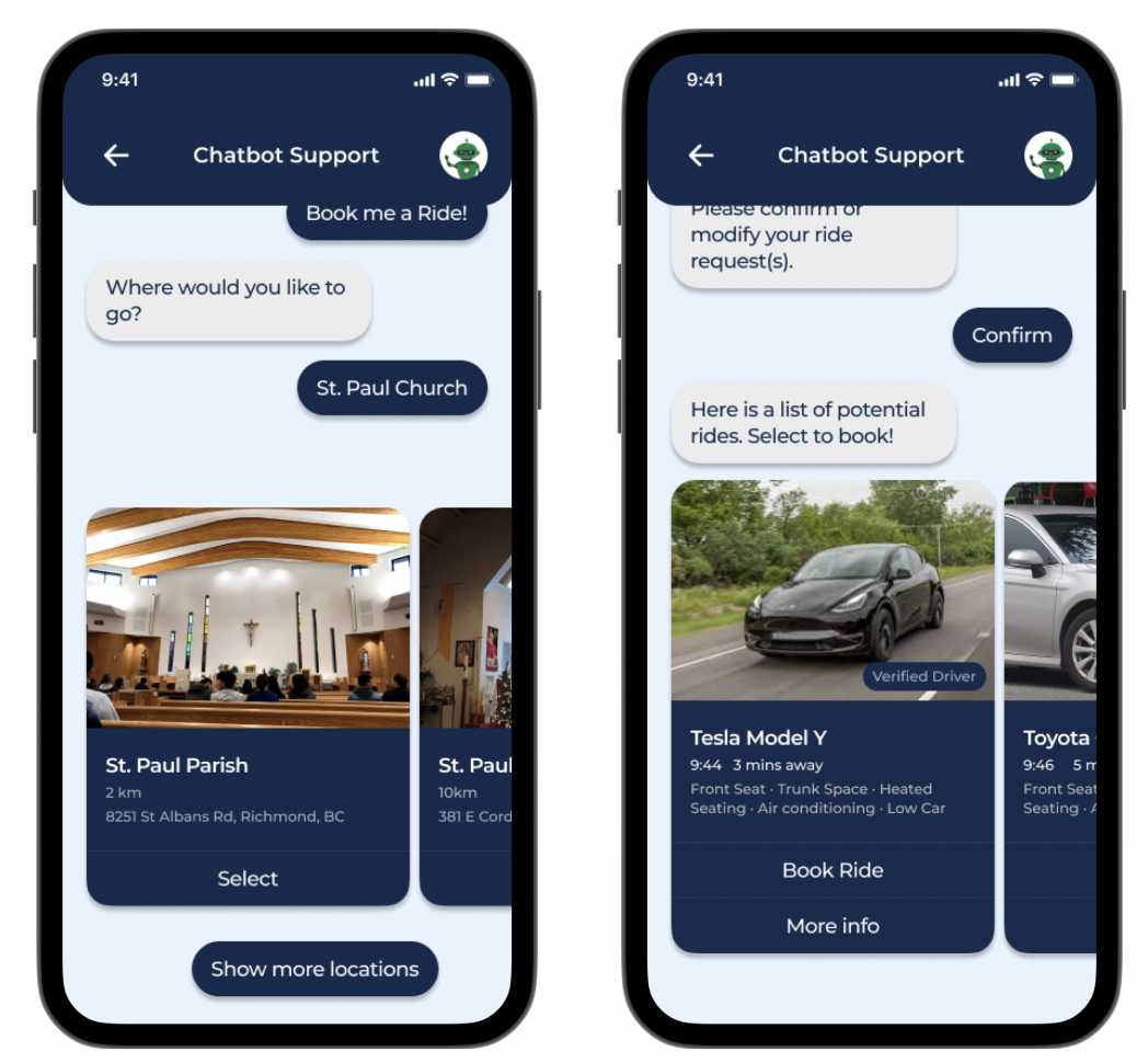
If users find it uncomfortable to book by independently searching or through pre-saved destinations, they can opt to use the chatbot support feature instead, located on a button near the middle top right of the screen.
the chatbot will prompt the user with questions regarding a list of locations that they could go to from their reply
the chatbot presents them with a choice of available cars within the area, with a description of their accommodations. These options can be viewed via horizontal scrolling
Lastly, call support is available to assist users who struggle with typing or require additional customizations to their ride. This way of booking makes the experience feel more catered for users who have particular needs or requests, removing the cognitive load of having to learn the app’s interface.
users can tap on the call to book button, redirecting them to a RideAway representative who will then prompt the user for details of their ride to make the booking
usability testing
In order to eventually reach our final prototype, we went through several iterations after collecting feedback from those that fell in our target audience. As we wanted to gain a different perspective, our in-person participants were one of my teammate’s grandparents, each with specific health concerns:
grandfather:
joint pain
dementia
hard of hearing
grandmother:
joint and hand pain
Our remote interview was conducted with a friend’s grandmother, who was recovering from a spine and knee surgery. I implemented the Think Aloud strategy for both in-person and remote interviews. Structured interviews were also conducted for the in-person user testing.
according to our research, users. . .
Find horizontal scrolling non-intuitive
Don’t understand the concept of two-factor authentication
Are confused with text-fields that contain a sample prompter
Confuse text labels for buttons
Find chatbot questions too broad
Think the purpose of some registration pages is unclear
why are these issues worth addressing?
Users might pause too long on the screen as they’re unsure of what to do next and risk being late
Users don’t understand the importance of verifying their identity
Not knowing that the text fields are just to help guide users make onboarding difficult
Unclear buttons and labels make information difficult to find
Users don’t know how to answer if questions are too open-ended
Lack of descriptions frustrate users and provide them with no cues
as a result, we proposed to:
Restrict the app to vertical scrolling so that everything is cohesive
Switch to email sign up instead of phone number and add step-by-step instructions
Remove sample prompters
Make design elements more consistent throughout
Make questions more specific, giving users direct instructions
Require more descriptions and instructions upon registering
final prototype of the 3 key interactions
research
Through this project, I learned how to approach the problem through a set of holistic solutions. I found myself to be immersed in the ways of how design can play a big role in benefitting the communities around us.
Working closely with my team and conducting usability tests with real people played a pivotal role in my understanding of empathy and user needs. By genuinely putting myself into the shoes of potential users, I was able to craft a prototype that highlighted the importance of communication and iteration within the design process. If I could go back in time and work on this all over again, I would focus on the finer details and micro-interactions that affect a user’s intuition when using the app; ones that I would never would’ve imagined in the midst of designing.
Through these small revisions, I hope to improve my understanding of how to support different demographics and see the world through their lens, creating a product that would recognize and effectively solve their needs.
recap of final prototype regarding the 3 key interactions
reflection